Clustering in Design Thinking: Making Sense of Empathy Data
Design thinking begins with empathy. To build it, we go into the world to listen, observe, and experience the lives of the people we’re designing for. When done earnestly, this research produces a flood of raw human-centered data: field notes, half-remembered impressions, photographs, phrases from interviews, even hours of recordings. It feels overwhelming – and it should.
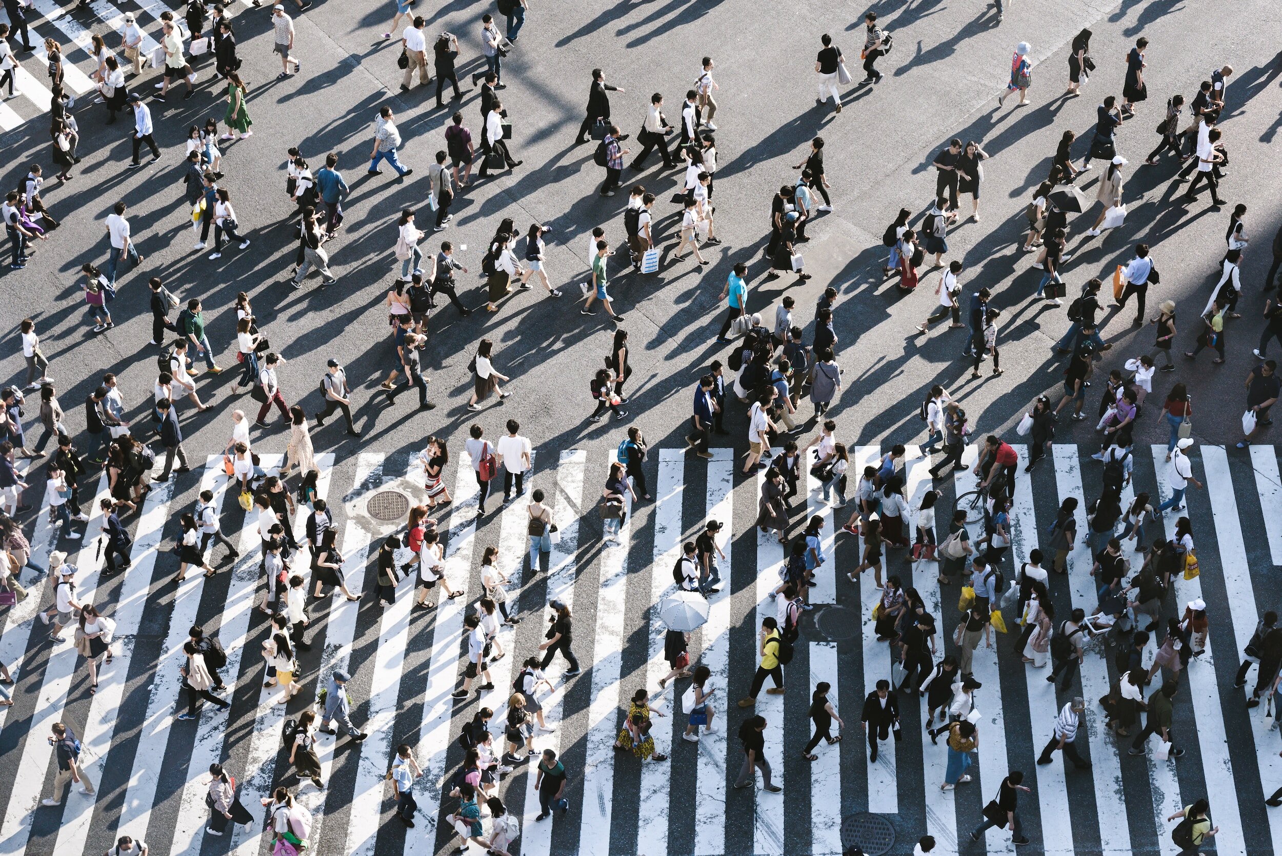
Figure 1: Representation of data the results from ethnographic, empathy building, research.
But what should you do with it all? Too often, teams skim the pile of data and pull out the bits that confirm what they already thought. That’s not empathy; that’s bias masquerading as research. The challenge is to resist the easy answer and put in the work to actually make sense of the chaos.
Use Clustering to Make Sense of the Chaos
Clustering is a sense-making tool – a way to externalize what you’ve learned and discover patterns that aren’t obvious at first glance. The mechanics are simple and tedious, but well worth the effort if they align the rest of the development process with the deeper, often unaddressed, human needs [3].
To use clustering:
Write every observation obtained through empathy research on its own sticky note. Don’t filter. Don’t compress. One note per insight, even if you repeat yourself.
Spread the notes across a wall or table. Begin grouping them into clusters of related ideas. Patterns will appear. Avoid the temptation to search for the “right” patterns that align with your intuition – that’s bias. The goal is to discover something new, not confirm what you think you already know.
Give each cluster a name (or theme), and capture all the supporting observations underneath. Note which themes are densely packed and which stand alone. Photograph or transcribe the results so they can be revisited later.
Shuffle the set of observations and repeat steps 1–3. Look with new eyes. The point is to see the problem from different angles.
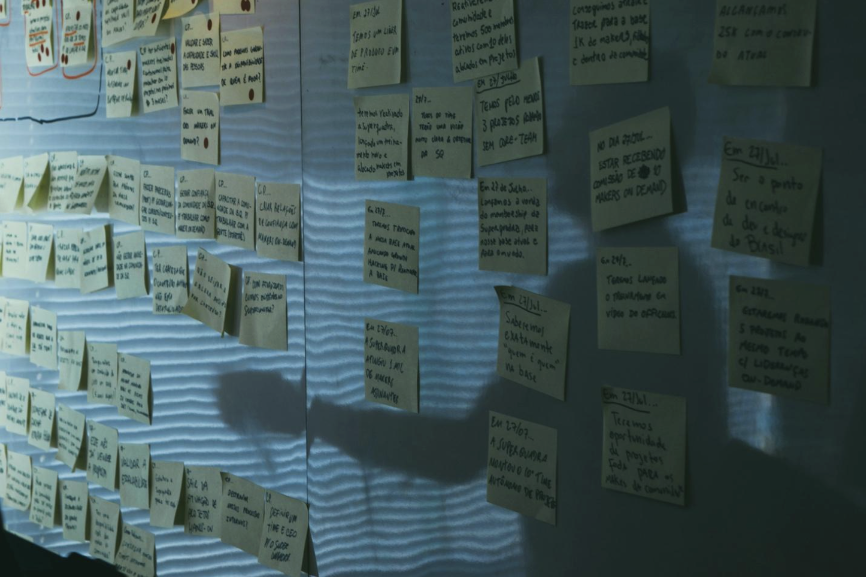
Figure 2: Sticky note clustering.
An Example
Consider something ordinary such as taking school attendance. First-pass themes might include Teaching disrupted by roll call, Data accuracy problems, Pressure from administrators, Never-ending busy work, Parent complaints, Privacy concerns, or Safety issues. That’s already useful. But after shuffling the sticky notes, more surprising patterns emerge: Students gaming the system, False absence alarms sent to parents, Attendance data used to identify long-term learning patterns, or Real-time location tracking for security. These themes shift the frame of the problem. They weren’t obvious at first, but they’re real – and they change how the problem is defined.
Historical Perspective
Among design methods, clustering has a lineage. In the 1960s, Japanese anthropologist Jiro Kawakita developed what came to be known as the KJ Method [1]. Faced with piles of qualitative field data, Kawakita devised a way to organize it into meaningful categories. His method spread into business, design, and engineering as a disciplined way of finding structure in ambiguity [4]. The KJ Method is the ancestor of today’s “affinity mapping” exercises you’ll see in design workshops. These kinds of clustering methods, when done with rigor, are far more than sticky notes on a wall – they are tools for reframing problems.

Figure 3: Jiro Kawakita
The connection between sticky notes and frames matters a lot. Kees Dorst, in Frame Innovation, argues that breakthrough design depends on creating new frames for problems [2]. If we keep the same frame, we only recycle the same answers. Clustering is one of the simplest ways to generate new frames.
Clustering, Affinity Diagrams, and the KJ Method: What’s the difference?
Clustering, affinity diagramming, and the KJ Method are part of the same family, but with different levels of formality. Clustering is the broad, everyday term for grouping observations so that themes can emerge. Affinity diagramming is a popular management and design practice – often used in quality engineering and UX design – that systematized clustering into a collaborative tool [5]. The KJ Method is the origin: a structured process Kawakita created in the 1960s to bring order to messy ethnographic data [4]. In practice, all three methods point to the same basic act of making sense by grouping, but the KJ Method has the deepest rigor, affinity diagrams brought it into business practice, and clustering is the shorthand designers use today [6].
Closing Thoughts
Clustering will never feel as glamorous as sketching or prototyping a concept. It’s slow. It’s mechanical. And it can be boring. But sticking with it and systematically crunching through the data is where clarity comes from. By forcing yourself to confront every observation, to shuffle and regroup until new themes appear, you give yourself the chance to see what your instincts alone would have missed.
Designers who skip this step are most often left developing in a vacuum, guided more by their own assumptions than by the people they set out to serve. Designers who embrace it uncover hidden needs, overlooked constraints, and unexpected opportunities. That’s the difference between good intentions and meaningful innovation.
So before you lock onto a solution, pause and ask: Have I given the human-centered data a chance to surprise me?
References
[1] Kawakita, Jiro. The Original KJ Method. Kawakita Research Institute, 1991.
[2] Dorst, Kees. Frame Innovation: Create New Thinking by Design. MIT Press, 2015.
[3] IDEO.org. The Field Guide to Human-Centered Design. IDEO, 2015. Available at: https://www.designkit.org/resources/1.html
[4] Scupin, Raymond. “The KJ Method: A Technique for Analyzing Data Derived from Japanese Ethnology.” Human Organization, vol. 56, no. 2, 1997, pp. 233–237.
[5] American Society for Quality (ASQ). “Affinity Diagram.” Accessed 2025. https://asq.org/quality-resources/affinity
[6] Stanford d.school. Bootleg: Design Thinking Method Cards. Stanford University, 2018. Available at: https://dschool.stanford.edu/tools/design-thinking-bootleg
To cite this article:
Mattson, Chris. “Clustering in Design Thinking: Making Sense of Empathy Data.” The BYU Design Review, 1 September 2025, https://www.designreview.byu.edu/collections/clustering-in-design-thinking-making-sense-of-empathy-data.